
[React Bootstrap] Alert を表示してみる | 心を無にして始める React

今回は、Alert コンポーネントを表示します。
Alert コンポーネントは、アラートメッセージの表示に使います。ユーザのアクションに対して、メッセージを使ったフィードバックを提供することができます。
準備
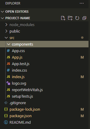
まだ components フォルダがなければ作ります。
src を右クリックして New Folder 。
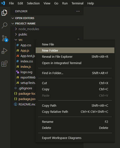
components と入力してフォルダを作ります。
今回は、components フォルダに Alert のコンポーネントを作って、表示してみます。
公式のドキュメントはここ。
https://react-bootstrap.github.io/components/alerts/
Alert コンポーネントをつくる
component フォルダに Alert.js を作ります。
Alert.js を心を無にして編集してみます。
import React from 'react';
import { Alert as BootstrapAlert } from 'react-bootstrap';

function Alert(props) {

  const {
    variant,
    children,
    ...otherProps
  } = props;

  return (
    <BootstrapAlert variant={variant} {...otherProps}>
      {children}
    </BootstrapAlert>
  );
}

export default Alert;
プロジェクトでは、コンポーネントを統一したデザインで利用することが多いです。
そのため、(React Bootstrap のコンポーネントをその場その場でカスタマイズしながら使うよりも、)プロジェクトでコンポーネントにしたものを使うほうが、変更をお手軽に漏れなくできることが多いです。
Alert コンポーネントを表示する
それでは、 App.js を編集して Alert コンポーネントを表示します。
import './App.css';
import Alert from './components/Alert';

function App() {
  return (
    <div className="m-5">
      <Alert variant="primary">
        これは primary カラーのアラートです。
      </Alert>
    </div>
  );
}

export default App;
画面を確認してみます。
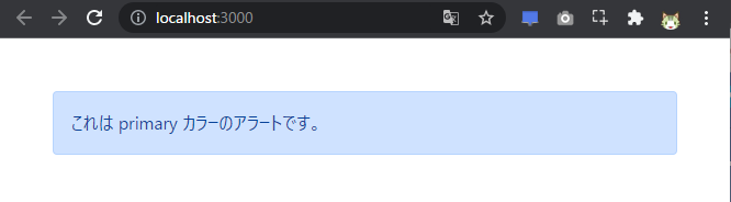
はい、できました。
✖ を押したら消えるようにする
Alert.js を編集して機能を増やします。
import React, { useState } from 'react';
import { Alert as BootstrapAlert } from 'react-bootstrap';
function Alert(props) {
const [show, setShow] = useState(true);
const {
variant,
dismissible,
children,
...otherProps
} = props;
return (
show && (
<BootstrapAlert
variant={variant}
dismissible={dismissible}
onClose={() => setShow(false)}
{...otherProps}
>
{children}
</BootstrapAlert>
)
)
}
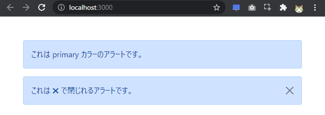
export default Alert;App.js に ✖ のあるAlert コンポーネントを追加で表示してみます。
import './App.css';
import Alert from './components/Alert';

function App() {
  return (
    <div className="m-5">
      <Alert variant="primary">
        これは primary カラーのアラートです。
      </Alert>
      <Alert variant="primary" dismissible>
        これは ✖ で閉じれるアラートです。
      </Alert>
    </div>
  );
}

export default App;
画面を確認してみます。
アラートの右側にある ✖ を押すと、アラートが消えます。
はい、できました。