
[React+Tailwind] Flowbite で Accordion を表示してみる | 心を無にして始める React

準備
Flowbite が使えるプロジェクトを準備します。
![[React] Tailwind CSS を使ってみる@準備回 | 心を無にして始める React](https://neko-note.org/wp-content/uploads/skill-image-100x100.jpg)
 https://neko-note.org/react-tailwind-css-install/1047
![[React] Flowbite を使ってみる@準備回 | 心を無にして始める React](https://neko-note.org/wp-content/uploads/flowbite-thumbnail-100x100.png)
Accordion コンポーネントをつくる
./src/components 配下に Accordion.js を作ります。
import { forwardRef } from 'react';
import { Accordion as FlowbiteAccordion } from 'flowbite-react';

const Accordion = forwardRef((
  {
    alwaysOpen = false,
    children,
    panels = [],
    flush = true,
    ...otherProps
  },
  ref,
) => {
  return (
    <FlowbiteAccordion
      alwaysOpen={alwaysOpen}
      flush={flush}
      ref={ref}
      {...otherProps}
    >
      {
        panels.map(panel => (
          <FlowbiteAccordion.Panel key={panel.id}>
            <FlowbiteAccordion.Title>
              {panel.title}
            </FlowbiteAccordion.Title>
            <FlowbiteAccordion.Content>
              {panel.content}
            </FlowbiteAccordion.Content>
          </FlowbiteAccordion.Panel>
        ))
      }
    </FlowbiteAccordion>
  );
});

export default Accordion;
Accordion コンポーネントをつかう
いつものように App.js を編集していきます。
import Accordion from './components/Accordion';
import './App.css';
const PANELS = [
{
id: 1,
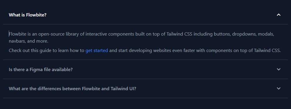
title: 'What is Flowbite?',
content: (
<>
<p className="mb-2 text-gray-500 dark:text-gray-400">
Flowbite is an open-source library of interactive components built on top of Tailwind CSS including buttons, dropdowns, modals, navbars, and more.
</p>
<p className="text-gray-500 dark:text-gray-400">
Check out this guide to learn how to{' '}
<a
href="https://flowbite.com/docs/getting-started/introduction/"
className="text-blue-600 hover:underline dark:text-blue-500"
>
get started
</a>
{' '}and start developing websites even faster with components on top of Tailwind CSS.
</p>
</>
),
},
{
id: 2,
title: 'Is there a Figma file available?',
content: (
<>
<p className="mb-2 text-gray-500 dark:text-gray-400">
Flowbite is first conceptualized and designed using the Figma software so everything you see in the library has a design equivalent in our Figma file.
</p>
<p className="text-gray-500 dark:text-gray-400">
Check out the{' '}
<a
href="https://flowbite.com/figma/"
className="text-blue-600 hover:underline dark:text-blue-500"
>
Figma design system
</a>
{' '}based on the utility classes from Tailwind CSS and components from Flowbite.
</p>
</>
),
},
{
id: 3,
title: 'What are the differences between Flowbite and Tailwind UI?',
content: (
<>
<p className="mb-2 text-gray-500 dark:text-gray-400">
The main difference is that the core components from Flowbite are open source under the MIT license, whereas Tailwind UI is a paid product. Another difference is that Flowbite relies on smaller and standalone components, whereas Tailwind UI offers sections of pages.
</p>
<p className="mb-2 text-gray-500 dark:text-gray-400">
However, we actually recommend using both Flowbite, Flowbite Pro, and even Tailwind UI as there is no technical reason stopping you from using the best of two worlds.
</p>
<p className="mb-2 text-gray-500 dark:text-gray-400">
Learn more about these technologies:
</p>
<ul className="list-disc pl-5 text-gray-500 dark:text-gray-400">
<li>
<a
href="https://flowbite.com/pro/"
className="text-blue-600 hover:underline dark:text-blue-500"
>
Flowbite Pro
</a>
</li>
<li>
<a
href="https://tailwindui.com/"
rel="nofollow"
className="text-blue-600 hover:underline dark:text-blue-500"
>
Tailwind UI
</a>
</li>
</ul>
</>
),
},
];
function App() {
return (
<div className="dark">
<div className="h-screen p-8 flex flex-col justify-center items-center dark:!bg-gray-900">
<Accordion
panels={PANELS}
/>
</div>
</div>
);
}
export default App;結果
はい、できました。