
[React Bootstrap] Placeholder を表示してみる | 心を無にして始める React

今回は、Placeholder コンポーネントを表示します。
準備
まだ components フォルダがなければ作ります。
src を右クリックして New Folder 。
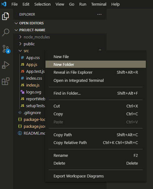
components と入力してフォルダを作ります。
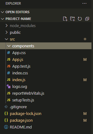
今回は、components フォルダに Placeholder のコンポーネントを作って、表示してみます。
公式のドキュメントはここ。
https://react-bootstrap.github.io/components/placeholder/
Placeholder コンポーネントをつくる
component フォルダに Placeholder.js を作ります。
Placeholder.js を心を無にして編集してみます。
import React from 'react';
import { Placeholder as BootstrapPlaceholder } from 'react-bootstrap';
import PlaceholderButton from './PlaceholderButton';

function Placeholder(props) {
  const {
    children,
    ...otherProps
  } = props;

  return (
    <BootstrapPlaceholder {...otherProps}>
      {children}
    </BootstrapPlaceholder>
  );
}

export default Object.assign(Placeholder, {
  Button: PlaceholderButton,
});
NavItem.js も続けて作ります。
import React from 'react';
import { Placeholder as BootstrapPlaceholder } from 'react-bootstrap';

function PlaceholderButton(props) {
  const {
    children,
    ...otherProps
  } = props;

  return (
    <BootstrapPlaceholder.Button {...otherProps}>
      {children}
    </BootstrapPlaceholder.Button>
  );
}

export default PlaceholderButton;
プロジェクトでは、コンポーネントを統一したデザインで利用することが多いです。
そのため、(React Bootstrap のコンポーネントをその場その場でカスタマイズしながら使うよりも、)プロジェクトでコンポーネントにしたものを使うほうが、変更をお手軽に漏れなくできることが多いです。
Placeholder コンポーネントを表示する
それでは、 App.js を編集して Placeholder コンポーネントを表示します。
import React from 'react';
import './App.css';
import Placeholder from './components/Placeholder';
function App() {
return (
<>
<div className="p-5 bg-white">
<div className="mb-3 p-3" style={{ border: 'dotted 2px #7777ff' }}>
<Placeholder xs={6} />
<Placeholder className="w-75" />
<Placeholder style={{ width: '60%' }} />
</div>
<div className="mb-3 p-3" style={{ border: 'dotted 2px #7777ff' }}>
<div className="d-flex gap-3">
<Placeholder.Button className="w-100" aria-hidden="true" />
<Placeholder.Button className="w-100" variant="secondary" aria-hidden="true" />
<Placeholder.Button className="w-100" variant="success" aria-hidden="true" />
<Placeholder.Button className="w-100" variant="danger" aria-hidden="true" />
<Placeholder.Button className="w-100" variant="warning" aria-hidden="true" />
<Placeholder.Button className="w-100" variant="info" aria-hidden="true" />
<Placeholder.Button className="w-100" variant="light" aria-hidden="true" />
<Placeholder.Button className="w-100" variant="dark" aria-hidden="true" />
</div>
</div>
<div className="mb-3 p-3" style={{ border: 'dotted 2px #7777ff' }}>
<Placeholder animation="wave">
<Placeholder xs={12} />
</Placeholder>
<Placeholder animation="glow">
<Placeholder xs={12} />
</Placeholder>
</div>
<div className="mb-3 p-3" style={{ border: 'dotted 2px #7777ff' }}>
<Placeholder xs={3} bg="primary" />
<Placeholder xs={3} bg="secondary" />
<Placeholder xs={3} bg="success" />
<Placeholder xs={3} bg="danger" />
<Placeholder xs={3} bg="warning" />
<Placeholder xs={3} bg="info" />
<Placeholder xs={3} bg="light" />
<Placeholder xs={3} bg="dark" />
</div>
<div className="mb-3 p-3" style={{ border: 'dotted 2px #7777ff' }}>
<Placeholder xs={12} size="lg" />
<Placeholder xs={12} />
<Placeholder xs={12} size="sm" />
<Placeholder xs={12} size="xs" />
</div>
</div>
</>
);
}
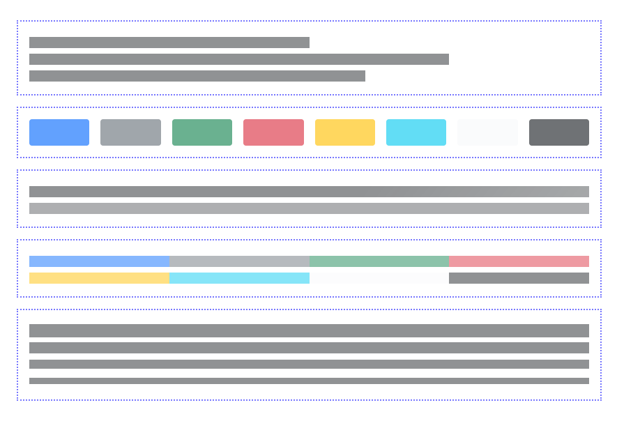
export default App;画面を確認してみます。

はい、できました。