
[React+Tailwind] Flowbite で Form を表示してみる | 心を無にして始める React

準備
Flowbite が使えるプロジェクトを準備します。
![[React] Tailwind CSS を使ってみる@準備回 | 心を無にして始める React](https://neko-note.org/wp-content/uploads/skill-image-100x100.jpg)
 https://neko-note.org/react-tailwind-css-install/1047
![[React] Flowbite を使ってみる@準備回 | 心を無にして始める React](https://neko-note.org/wp-content/uploads/flowbite-thumbnail-100x100.png)
Form コンポーネントをつくる
./src/components 配下に Form.js を作ります。
入力に使いそうなコントロールをまとめて実装します。
- ラベル (Label)
- テキストボックス (TextInput)
- テキストエリア (Textarea)
- チェックボックス (Checkbox)
- セレクトボックス (Select)
- ラジオボタン (Radio)
- トグルボタン (ToggleSwitch)
- ファイル選択 (File)
import { forwardRef } from 'react';
import {
  Checkbox as FlowbiteCheckbox,
  FileInput as FlowbiteFileInput,
  Label as FlowbiteLabel,
  Radio as FlowbiteRadio,
  Select as FlowbiteSelect,
  Textarea as FlowbiteTextarea,
  TextInput as FlowbiteTextInput,
  ToggleSwitch as FlowbiteToggleSwitch,
} from 'flowbite-react';

const Form = forwardRef((
  {
    children,
    ...otherProps
  },
  ref,
) => {
  return (
    <form
      ref={ref}
      {...otherProps}
    >
      {children}
    </form>
  );
});

const Checkbox = forwardRef((
  {
    ...otherProps
  },
  ref,
) => {
  return (
    <FlowbiteCheckbox
      ref={ref}
      {...otherProps}
    />
  );
});

const FileInput = forwardRef((
  {
    color = "gray",
    helperText,
    sizing = "md",
    ...otherProps
  },
  ref,
) => {
  return (
    <FlowbiteFileInput
      color={color}
      helperText={helperText}
      ref={ref}
      sizing={sizing}
      {...otherProps}
    />
  );
});

const Label = forwardRef((
  {
    children,
    color = 'default',
    disabled = false,
    value,
    ...otherProps
  },
  ref,
) => {
  return (
    <FlowbiteLabel
      color={color}
      disabled={disabled}
      ref={ref}
      value={value}
      {...otherProps}
    >
      {children}
    </FlowbiteLabel>
  );
});

const Radio = forwardRef((
  {
    ...otherProps
  },
  ref,
) => {
  return (
    <FlowbiteRadio
      ref={ref}
      {...otherProps}
    />
  );
});

const Select = forwardRef((
  {
    addon,
    children,
    color = 'gray',
    helperText,
    icon,
    shadow = false,
    sizing = 'md',
    ...otherProps
  },
  ref,
) => {
  return (
    <FlowbiteSelect
      addon={addon}
      color={color}
      helperText={helperText}
      icon={icon}
      ref={ref}
      shadow={shadow}
      sizing={sizing}
      {...otherProps}
    >
      {children}
    </FlowbiteSelect>
  );
});

const Textarea = forwardRef((
  {
    color = 'gray',
    helperText,
    shadow = false,
    ...otherProps
  },
  ref,
) => {
  return (
    <FlowbiteTextarea
      color={color}
      helperText={helperText}
      ref={ref}
      shadow={shadow}
      {...otherProps}
    />
  );
});

const TextInput = forwardRef((
  {
    addon,
    color = 'gray',
    helperText,
    icon,
    shadow = false,
    sizing = 'md',
    ...otherProps
  },
  ref,
) => {
  return (
    <FlowbiteTextInput
      addon={addon}
      color={color}
      helperText={helperText}
      icon={icon}
      ref={ref}
      shadow={shadow}
      sizing={sizing}
      {...otherProps}
    />
  );
});

const ToggleSwitch = forwardRef((
  {
    checked = false,
    label,
    onChange,
    ...otherProps
  },
  ref,
) => {
  return (
    <FlowbiteToggleSwitch
      checked={checked}
      label={label}
      onChange={onChange}
      ref={ref}
      {...otherProps}
    />
  );
});

export default Object.assign(Form, {
  Checkbox,
  FileInput,
  Label,
  Radio,
  Select,
  Textarea,
  TextInput,
  ToggleSwitch,
});
Form コンポーネントをつかう
いつものように App.js を編集していきます。
import { useState } from 'react';
import { EnvelopeIcon } from '@heroicons/react/24/solid';

import Form from './components/Form';
import './App.css';

function App() {

  const [checked, setChecked] = useState(false);

  return (
    <div className="dark">
      <div className="min-h-screen p-8 flex flex-col justify-center items-center dark:!bg-gray-900">
        <div className="w-1/2">
          <Form className="flex flex-col gap-3">
            <div>
              <div className="mb-2 block">
                <Form.Label
                  htmlFor="email1"
                  value="Your email"
                />
              </div>
              <Form.TextInput
                id="email1"
                type="email"
                placeholder="name@example.com"
                required={true}
                icon={EnvelopeIcon}
              />
            </div>
            <div>
              <div className="mb-2 block">
                <Form.Label
                  htmlFor="password1"
                  value="Your password"
                />
              </div>
              <Form.TextInput
                id="password1"
                type="password"
                required={true}
              />
            </div>
            <div className="flex items-center gap-2">
              <Form.Checkbox id="remember" />
              <Form.Label htmlFor="remember">
                Remember me
              </Form.Label>
            </div>
            <hr />
            <div>
              <div className="mb-2 block">
                <Form.Label
                  htmlFor="countries"
                  value="Select your country"
                />
              </div>
              <Form.Select
                id="countries"
                required={true}
              >
                <option>
                  United States
                </option>
                <option>
                  Canada
                </option>
                <option>
                  France
                </option>
                <option>
                  Germany
                </option>
              </Form.Select>
            </div>
            <fieldset
              className="flex flex-col gap-4"
              id="radio"
            >
              <legend className="mb-3 dark:text-white">
                Choose your favorite country
              </legend>
              <div className="flex items-center gap-2">
                <Form.Radio
                  id="united-state"
                  name="countries"
                  value="USA"
                  defaultChecked={true}
                />
                <Form.Label htmlFor="united-state">
                  United States
                </Form.Label>
              </div>
              <div className="flex items-center gap-2">
                <Form.Radio
                  id="germany"
                  name="countries"
                  value="Germany"
                />
                <Form.Label htmlFor="germany">
                  Germany
                </Form.Label>
              </div>
              <div className="flex items-center gap-2">
                <Form.Radio
                  id="spain"
                  name="countries"
                  value="Spain"
                />
                <Form.Label htmlFor="spain">
                  Spain
                </Form.Label>
              </div>
              <div className="flex items-center gap-2">
                <Form.Radio
                  id="uk"
                  name="countries"
                  value="United Kingdom"
                />
                <Form.Label htmlFor="uk">
                  United Kingdom
                </Form.Label>
              </div>
              <div className="flex items-center gap-2">
                <Form.Radio
                  id="china"
                  name="countries"
                  value="China"
                  disabled={true}
                />
                <Form.Label
                  htmlFor="china"
                  disabled={true}
                >
                  China (disabled)
                </Form.Label>
              </div>
            </fieldset>
            <div>
              <div className="mb-2 block">
                <Form.Label
                  htmlFor="file"
                  value="Upload file"
                />
              </div>
              <Form.FileInput
                id="file"
                helperText="A profile picture is useful to confirm your are logged into your account"
              />
            </div>
            <div
              className="flex flex-col gap-4"
            >
              <Form.ToggleSwitch
                checked={checked}
                label="Toggle me"
                onChange={() => { setChecked(!checked) }}
              />
            </div>
            <hr />
            <div>
              <div className="mb-2 block">
                <Form.Label
                  htmlFor="small"
                  value="Small input"
                />
              </div>
              <Form.TextInput
                id="small"
                type="text"
                sizing="sm"
                shadow={true}
                helperText={<span>This is helper text. Small input.</span>}
              />
            </div>
            <div>
              <div className="mb-2 block">
                <Form.Label
                  htmlFor="base"
                  value="Base input"
                />
              </div>
              <Form.TextInput
                id="base"
                type="text"
                sizing="md"
                shadow={true}
                helperText={<span>This is helper text. Medium input.</span>}
              />
            </div>
            <div>
              <div className="mb-2 block">
                <Form.Label
                  htmlFor="large"
                  value="Large input"
                />
              </div>
              <Form.TextInput
                id="large"
                type="text"
                sizing="lg"
                shadow={true}
                helperText={<span>This is helper text. Large input.</span>}
              />
            </div>
            <div>
              <div className="mb-2 block">
                <Form.Label
                  htmlFor="comment"
                  value="Your message"
                />
              </div>
              <Form.Textarea
                id="comment"
                placeholder="Leave a comment..."
                required={true}
                rows={4}
              />
            </div>
            <hr />
            <div>
              <div className="mb-2 block">
                <Form.Label
                  htmlFor="username"
                  value="Username"
                />
              </div>
              <Form.TextInput
                id="username3"
                placeholder="Bonnie Green"
                required={true}
                addon="@"
              />
            </div>
          </Form>
        </div>
        <div className="mt-4 flex gap-3">
        </div>
      </div>
    </div>
  );
}

export default App;
結果
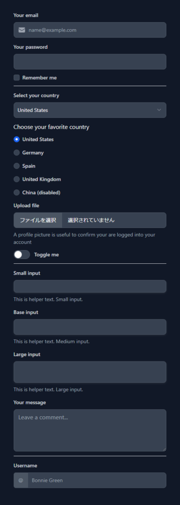
はい、できました。