
[React+Tailwind] Flowbite で Sidebar を表示してみる | 心を無にして始める React

準備
Flowbite が使えるプロジェクトを準備します。
![[React] Tailwind CSS を使ってみる@準備回 | 心を無にして始める React](https://neko-note.org/wp-content/uploads/skill-image-100x100.jpg)
 https://neko-note.org/react-tailwind-css-install/1047
![[React] Flowbite を使ってみる@準備回 | 心を無にして始める React](https://neko-note.org/wp-content/uploads/flowbite-thumbnail-100x100.png)
Sidebar コンポーネントをつくる
./src/components 配下に Sidebar.js を作ります。
import React, { forwardRef } from 'react';
import {
  Sidebar as FlowbiteSidebar,
} from 'flowbite-react';

const Sidebar = forwardRef((
  {
    children,
    collapseBehavior,
    collapsed,
    ...otherProps
  },
  ref,
) => {
  return (
    <FlowbiteSidebar
      collapseBehavior={collapseBehavior}
      collapsed={collapsed}
      ref={ref}
      {...otherProps}
    >
      {children}
    </FlowbiteSidebar>
  );
});

const SidebarCollapse = forwardRef((
  {
    active = false,
    as,
    children,
    href,
    icon,
    label,
    labelColor,
    ...otherProps
  },
  ref,
) => {
  return (
    <FlowbiteSidebar.Collapse
      active={active}
      as={as}
      href={href}
      icon={icon}
      label={label}
      labelColor={labelColor}
      ref={ref}
      {...otherProps}
    >
      {children}
    </FlowbiteSidebar.Collapse>
  );
});

const SidebarCTA = forwardRef((
  {
    children,
    color,
    ...otherProps
  },
  ref,
) => {
  return (
    <FlowbiteSidebar.CTA
      color={color}
      ref={ref}
      {...otherProps}
    >
      {children}
    </FlowbiteSidebar.CTA>
  );
});

const SidebarItems = forwardRef((
  {
    children,
    ...otherProps
  },
  ref,
) => {
  return (
    <FlowbiteSidebar.Items
      ref={ref}
      {...otherProps}
    >
      {children}
    </FlowbiteSidebar.Items>
  );
});

const SidebarItemGroup = forwardRef((
  {
    children,
    ...otherProps
  },
  ref,
) => {
  return (
    <FlowbiteSidebar.ItemGroup
      ref={ref}
      {...otherProps}
    >
      {children}
    </FlowbiteSidebar.ItemGroup>
  );
});

const SidebarItem = forwardRef((
  {
    active = false,
    as,
    children,
    href,
    icon,
    label,
    labelColor,
    ...otherProps
  },
  ref,
) => {
  return (
    <FlowbiteSidebar.Item
      active={active}
      as={as}
      href={href}
      icon={icon}
      label={label}
      labelColor={labelColor}
      ref={ref}
      {...otherProps}
    >
      {children}
    </FlowbiteSidebar.Item>
  );
});

const SidebarLogo = forwardRef((
  {
    children,
    className,
    href,
    img,
    imgAlt,
    ...otherProps
  },
  ref,
) => {
  return (
    <FlowbiteSidebar.Logo
      className={className}
      href={href}
      img={img}
      imgAlt={imgAlt}
      ref={ref}
      {...otherProps}
    >
      {children}
    </FlowbiteSidebar.Logo>
  );
});

export default Object.assign(Sidebar, {
  Collapse: SidebarCollapse,
  CTA: SidebarCTA,
  Item: SidebarItem,
  ItemGroup: SidebarItemGroup,
  Items: SidebarItems,
  Logo: SidebarLogo,
});
Sidebar コンポーネントをつかう
いつものように App.js を編集していきます。
import { ArrowDownTrayIcon, CheckIcon, ChevronDoubleDownIcon, ChevronDoubleUpIcon, ChevronDownIcon, ChevronUpIcon, CubeIcon } from '@heroicons/react/24/solid';

import './App.css';
import Badge from './components/Badge';
import Sidebar from './components/Sidebar';

function App() {
  return (
    <div className="min-h-screen w-full flex flex-grow dark:text-white dark:!bg-gray-900">
      <div className="w-fit">
        <Sidebar aria-label="Sidebar with call to action button example">
          <Sidebar.Logo
            href="#"
            img="https://placehold.jp/48/000000/ffffff/320x100.png?text=Site%20LOGO&css=%7B%22background-color%22%3A%22%20transparent%22%7D"
            imgAlt="Site Logo"
          >
            SiteName
          </Sidebar.Logo>
          <Sidebar.Items>
            <Sidebar.ItemGroup>
              <Sidebar.Item
                href="#"
                icon={CubeIcon}
              >
                Dashboard
              </Sidebar.Item>
              <Sidebar.Collapse
                icon={CubeIcon}
                label="E-commerce"
              >
                <Sidebar.Item href="#">
                  Products
                </Sidebar.Item>
              </Sidebar.Collapse>
              <Sidebar.Item
                href="#"
                icon={CubeIcon}
              >
                Inbox
              </Sidebar.Item>
              <Sidebar.Item
                href="#"
                icon={CubeIcon}
              >
                Users
              </Sidebar.Item>
              <Sidebar.Item
                href="#"
                icon={CubeIcon}
              >
                Products
              </Sidebar.Item>
              <Sidebar.Item
                href="#"
                icon={CubeIcon}
              >
                Sign In
              </Sidebar.Item>
              <Sidebar.Item
                href="#"
                icon={CubeIcon}
              >
                Sign Up
              </Sidebar.Item>
            </Sidebar.ItemGroup>
          </Sidebar.Items>
          <Sidebar.CTA>
            <div className="mb-3 flex items-center">
              <Badge color="warning">
                Beta
              </Badge>
              <button
                aria-label="Close"
                className="-m-1.5 ml-auto inline-flex h-6 w-6 rounded-lg bg-blue-50 p-1 text-blue-900 hover:bg-blue-200 focus:ring-2 focus:ring-blue-400 dark:bg-blue-900 dark:text-blue-400 dark:hover:bg-blue-800"
                type="button"
              >
                <svg
                  aria-hidden={true}
                  className="h-4 w-4"
                  fill="currentColor"
                  viewBox="0 0 20 20"
                  xmlns="http://www.w3.org/2000/svg"
                >
                  <path
                    fillRule="evenodd"
                    d="M4.293 4.293a1 1 0 011.414 0L10 8.586l4.293-4.293a1 1 0 111.414 1.414L11.414 10l4.293 4.293a1 1 0 01-1.414 1.414L10 11.414l-4.293 4.293a1 1 0 01-1.414-1.414L8.586 10 4.293 5.707a1 1 0 010-1.414z"
                    clipRule="evenodd"
                  />
                </svg>
              </button>
            </div>
            <p className="mb-3 text-sm text-blue-900 dark:text-blue-400">
              Preview the new Flowbite dashboard navigation! You can turn the new navigation off for a limited time in your profile.
            </p>
            <a
              className="text-sm text-blue-900 underline hover:text-blue-800 dark:text-blue-400 dark:hover:text-blue-300"
              href="#"
            >
              Turn new navigation off
            </a>
          </Sidebar.CTA>
        </Sidebar>
      </div>
    </div>
  );
}

export default App;
結果
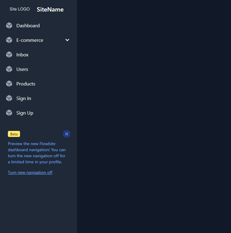
はい、できました。