
[React+Tailwind] Flowbite で Alert を表示してみる | 心を無にして始める React

準備
Flowbite が使えるプロジェクトを準備します。
![[React] Tailwind CSS を使ってみる@準備回 | 心を無にして始める React](https://neko-note.org/wp-content/uploads/skill-image-100x100.jpg)
 https://neko-note.org/react-tailwind-css-install/1047
![[React] Flowbite を使ってみる@準備回 | 心を無にして始める React](https://neko-note.org/wp-content/uploads/flowbite-thumbnail-100x100.png)
Alert コンポーネントをつくる
./src/components 配下に Alert.js を作ります。
import { forwardRef } from 'react';
import { Alert as FlowbiteAlert } from 'flowbite-react';

const Alert = forwardRef(({
  show,
  additionalContent,
  children,
  color = "success",
  icon,
  onDismiss,
  rounded = true,
  withBorderAccent = true,
  ...otherProps
}, ref) => {

  if (!show) {
    return <></>;
  }

  return (
    <FlowbiteAlert
      additionalContent={additionalContent}
      color={color}
      icon={icon}
      onDismiss={onDismiss}
      ref={ref}
      rounded={rounded}
      withBorderAccent={withBorderAccent}
      {...otherProps}
    >
      {children}
    </FlowbiteAlert>
  );
})

export default Alert;
Alert コンポーネントをつかう
いつものように App.js を編集していきます。
import { Fragment, useCallback, useState } from 'react';
import { InformationCircleIcon } from '@heroicons/react/24/solid'

import Alert from './components/Alert';
import './App.css';

function App() {
  const [show, setShow] = useState(true);

  const onDismiss = useCallback(() => setShow(!show), [show]);

  return (
    <div className="h-screen p-8 flex flex-col justify-center items-center bg-slate-900">
      <Alert
        show={show}
        color="success"
        rounded={false}
        withBorderAccent={true}
        onDismiss={onDismiss}
        additionalContent={
          <Fragment>
            <div className="mt-2 mb-4 text-sm text-green-700 dark:text-green-800">
              More info about this info alert goes here. This example text is going to run a bit longer so that you can see how spacing within an alert works with this kind of content.
            </div>
          </Fragment>
        }
        icon={InformationCircleIcon}
      >
        <h3 className="text-lg font-medium text-green-700 dark:text-green-800">
          This is a info alert
        </h3>
      </Alert>
    </div>
  );
}

export default App;
結果
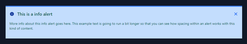
はい、できました。