
[React+Tailwind] Flowbite で Modal を表示してみる | 心を無にして始める React

準備
Flowbite が使えるプロジェクトを準備します。
![[React] Tailwind CSS を使ってみる@準備回 | 心を無にして始める React](https://neko-note.org/wp-content/uploads/skill-image-100x100.jpg)
 https://neko-note.org/react-tailwind-css-install/1047
![[React] Flowbite を使ってみる@準備回 | 心を無にして始める React](https://neko-note.org/wp-content/uploads/flowbite-thumbnail-100x100.png)
Modal コンポーネントをつくる
./src/components 配下に Modal.js を作ります。
import React, { forwardRef } from 'react';
import {
  Modal as FlowbiteModal,
} from 'flowbite-react';

const Modal = forwardRef((
  {
    children,
    onClose,
    position = "center",
    popup = false,
    root,
    show,
    size,
    ...otherProps
  },
  ref,
) => {
  return (
    <FlowbiteModal
      onClose={onClose}
      position={position}
      popup={popup}
      root={root}
      show={show}
      ref={ref}
      size={size}
      {...otherProps}
    >
      {children}
    </FlowbiteModal>
  );
});

const ModalHeader = forwardRef((
  {
    children,
    ...otherProps
  },
  ref,
) => {
  return (
    <FlowbiteModal.Header
      ref={ref}
      {...otherProps}
    >
      {children}
    </FlowbiteModal.Header>
  );
});

const ModalBody = forwardRef((
  {
    children,
    ...otherProps
  },
  ref,
) => {
  return (
    <FlowbiteModal.Body
      ref={ref}
      {...otherProps}
    >
      {children}
    </FlowbiteModal.Body>
  );
});

const ModalFooter = forwardRef((
  {
    children,
    ...otherProps
  },
  ref,
) => {
  return (
    <FlowbiteModal.Footer
      ref={ref}
      {...otherProps}
    >
      {children}
    </FlowbiteModal.Footer>
  );
});

export default Object.assign(Modal, {
  Header: ModalHeader,
  Body: ModalBody,
  Footer: ModalFooter,
});
Modal コンポーネントをつかう
いつものように App.js を編集していきます。
import { useState } from 'react';

import './App.css';
import Modal from './components/Modal';
import Button from './components/Button';

function App() {

  const [show, setShow] = useState(false);

  const onClick = () => {
    setShow(true);
  }

  const onClose = () => {
    setShow(false);
  }

  return (
    <div className="min-h-screen p-8 gap-4 flex flex-col justify-center items-center dark:!bg-gray-900">
      <Button onClick={onClick}>
        Toggle modal
      </Button>
      <Modal
        show={show}
        onClose={onClose}
      >
        <Modal.Header>
          Terms of Service
        </Modal.Header>
        <Modal.Body>
          <div className="space-y-6">
            <p className="text-base leading-relaxed text-gray-500 dark:text-gray-400">
              With less than a month to go before the European Union enacts new consumer privacy laws for its citizens, companies around the world are updating their terms of service agreements to comply.
            </p>
            <p className="text-base leading-relaxed text-gray-500 dark:text-gray-400">
              The European Union’s General Data Protection Regulation (G.D.P.R.) goes into effect on May 25 and is meant to ensure a common set of data rights in the European Union. It requires organizations to notify users as soon as possible of high-risk data breaches that could personally affect them.
            </p>
          </div>
        </Modal.Body>
        <Modal.Footer>
          <Button onClick={onClick}>
            I accept
          </Button>
          <Button
            color="gray"
            onClick={onClick}
          >
            Decline
          </Button>
        </Modal.Footer>
      </Modal>
    </div>
  );
}

export default App;
これまで、簡単のためにダークモードの指定を App.jp でしてきましたが、書く場所の変更が必要になります。
Modal の DOM は Appコンポーネントの範囲内には配置されず、body直下に配置されます。
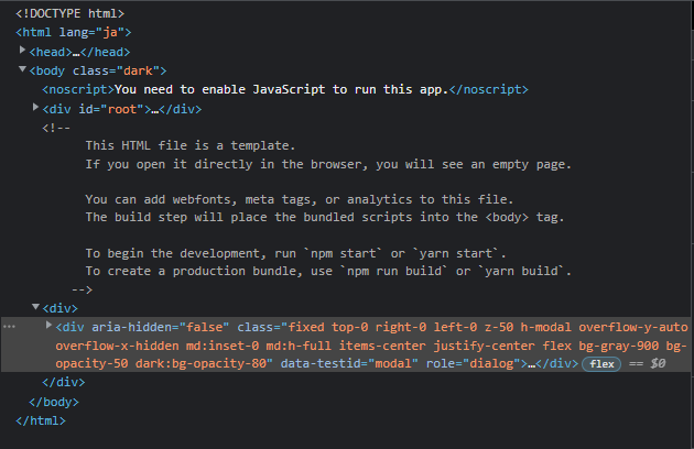
そのため、ダークモードの指定場所も App.js ではなく、bodyタグにすることになります。
index.html を開いて、bodyタグを修正します。
<body class="dark">
結果
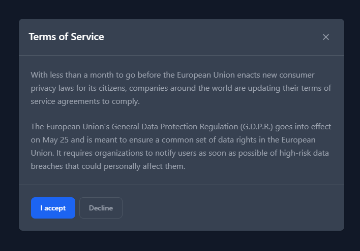
はい、できました。